The question
Let the product name remain the first read while giving secondary information a consistent supporting position.
The visible decision
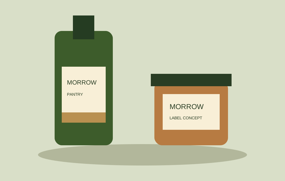
A cream label connects the two containers. The product name has a clear place above the smaller descriptors, while green and warm brown distinguish the vessel shapes.
What the study contains
A bottle-label concept and a related jar application, shown together as an original vector illustration.
Actual source content, output requirements and approval responsibilities would be defined for a commissioned project. This study explains the design shown here.
Discuss a related project ↗